
The rise in the employment ratio in March was impressive, which follows on some previously strong data. The usual complaint about the Household Survey is that it is noisy from month-to-month. As shown below, the number of jobs created per month over the last six months is 245 thousand. This could just be a reversal of a temporary dip at the end of 2013, but it bears watching.

There have been issues with seasonal adjustment being impacted by the financial crisis. As shown below, looking at the year-on-year changes on the non-seasonally adjusted employment ratio gives a similar picture.

Labour Market Slack
Although jobs are once again being created, there is no doubt that there is a large amount of slack in the labour market.

On of the worries I have seen is that full time jobs are being replaced by part-time jobs (as a result of health insurance changes), and that people are being forced to work two (or more) jobs. The chart above shows the number of people who hold multiple jobs, and this number remains at a relatively low level. This indicates that if part-time jobs are replacing full-time jobs, people are not replacing the hours with multiple jobs.
Additionally, this chart shows one measure of labour market slack. It seems reasonable to assume that if the economy was closer to full employment, the number of multiple job holders would rise back closer to the recent norm of 7.5 people, or about half a million part-time positions. Since those workers are not unemployed, that is half a million jobs that could be created without moving the unemployment rate.

The chart above shows another category of the population: Not In Labor Force, Want A Job Now. Eyeballing this chart tells us that any sort of life in the labour market will draw these individuals back in. Using the previous cycle as a benchmark, there is another one million jobs that could be created to draw these people back into the labour force.
Note that this is not a comprehensive measure of the level of underemployment in the economy. I just wanted to highlight a couple of sources of underemployment within the broader category.
Whither The Economic Cycle?
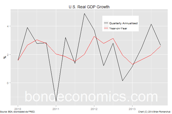
Take the chart above of real GDP since 2010. The quarterly growth rate of GDP has swung around wildly over that period, as various ripples hit the economy. It would have taken a lot of luck and/or skill to foretell those swings. But the question is: so what? Over the period, the unemployment rate and the employment ratio serenely followed linear trend lines. Fed rate hikes were always a considerable distance away.
Hiring and firing decisions are done on a strategic fashion during an expansion, and so the pace of hiring is smooth. This smoothness of job creation damps out the wiggles in activity; inventories and cash buffers are used to deal with uncertainty.
The cycle only matters if there is a sustained acceleration away from the trend growth rate (in either direction). After four years into the expansion, it seems hard to see the rate of growth suddenly rising rapidly. The thing to watch out for is a recession. Although I see areas of worry, I do not see any conclusive reason to forecast a recession in the near term; the labour market data is not pointing to such an outcome.
(c) Brian Romanchuk 2014
No comments:
Post a Comment
Note: Posts are manually moderated, with a varying delay. Some disappear.
The comment section here is largely dead. My Substack or Twitter are better places to have a conversation.
Given that this is largely a backup way to reach me, I am going to reject posts that annoy me. Please post lengthy essays elsewhere.